Wednesday 4 November 2015

Presentation of Images P5

Purpose


The purpose of making and editing these images are for movie posters.Noways,in many movies,they used de-saturation methods.Therefore,I used this method as well to edit my images.In addition,In a lot of traditional Chinese style movies.They give a mystery felling to many parts in the movies shots.Therefore,I used vignette method to edit my image as well to apply and match the movie style.


Work 1


The purpose of making and editing,this image is for a movie poster.Nowadays,in many movies,there are many shot had been de-saturated.Therefore,I used this method as well to edit this image.The de-saturation allows th  e background changed it's original color style and became more suitable for the background of a movie poster.The orange vignette allows people focus on the centre of this picture which is my model and the fan.Moreover,the white color of the text stand out from the image and it made sure people can see the name and read easily.Finally,the movie credit is in the underneaths part.

Work 2


The purpose of this image is also for a movie poster,the white title is at the top of the picture (in the heart of cloudy).Also,the movie credit is at the bottom with a black background.The fan is at the middle of this picture.This color style of this image is warm,and the green plants in the right and left side of model works well.

Work 3


The white title is at the top of the movie poster with Chinese and English,therefore,people can see the name of the movie clearly.The vignette is also allows drake side and let the middle part stand out.The window at back looks grey which gives out a mystery feeling.The whole feeling of this poster is really stand out with a classical style.

Work 4


The grey background just like the name of the movie - in the love of cloudy.This give a mystery feeling and attract people's attention.The black titles with drop shadow effects made sure people can see the clearly.The background looks like a painting work.The building behind model looks like a really old building as well.Especially the moss at the left part.


Work 5


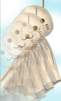
The background is pure black,therefore the white title is really stand out.The arm of model is a really nice compensation for this picture.The fan is also at the right middle of the image.The silk works really well in this image which gives out a really good quality.

Work 6


The pink colour of Chinese and English titles at the right part is really clearly,people can read and see them easily.The background had been de-satrationed.The image followed the rule of third,and the street is a leading line.

Work 7


The background is a wall,I changed the level of the background,so it became much more darker.I selected two models from different images and I put them into the poster together.The white title is standing out from 'black' background.And the gold colour of movie credit made sure people is able to read them.Also,there is a layer which is the white fan,I put it into the background.The gold color of movie credit works really well for this poster.


Work 8


This image has been de-saturated which applied the de-saturation shot in many traditional movies.The model was standing at the middle of the image,it was also on the line where cut the image into two parts(wall and door).The compensation of color is interesting as well,the wall side is white and the door side is black.Stand back and look this poster,the whole color style is based on white,black and grey.But the only colorful part is sit at the right middle,which is the pink flowers on the fan.


Tuesday 3 November 2015

Edit Photographic Images P4

Adobe Photoshop

Adobe Photoshop is a raster graphics editor developed and published by Adobe Systems for Windows and OS X.I use photoshop to edit my photos to give a high stand and quality movie posters.


Work 1


First of all,I opened this image with photoshop and I unlock it as layer 0.


I added a new adjustment layer which allowed me to change the Hun and Saturation*.

Hun and Saturation* Hue, saturation, and brightness are aspects of colour in the red, green, and blue scheme. These terms are most often used in reference to the colour of each pixel in a cathode ray tube display. All possible colours can be specified according to hue, saturation, and brightness (also called brilliance ), just as colours can be represented in terms of the R, G, and B components.


I changed the saturation and Hue,below is the date.


I select the adjustment layer and used eraser tool to rub out the effect on the skin of my model and fan.I also changed the lightness to -15,this allow the background became darker and let the main subject in this photo (model and fan) stand out.


-25 Hue changed the colour of the umbrella and the trees.This allows my model stand out from the background.


I downloaded a vignette from internet and put it above this image.


               Next,I opened layer style and it allows me to choose the opacity of the vignette.


The image with vignette and without saturation and Hue layer.


                                    The image with both vignette and saturation and Hue layer.


Finally,I put the text in.


The layer style allowed me to change the effect for these text.I used drop shadow and innor shadow to let the text standout in this image.I gave the movie a name called "In the heart of cloudy".In the end,I also put a movie credit at the bottom of this photo.

Work 2


First of all,I started with a new blank image.I selected 850 pixels for width and 1250 pixels for hight.This is a right size for magazines and movie posters with a high stand quality.


I used paint bucket tool to fill in a grey colour to create my background.In addition,the reason I choose to use a grey colour is grey would match this picture and it gives a strong mystery feeling.


 I opened another layer and used paint bucket tool to fill in a darker grey colour.


After that,I put my row image above this.


I put my row image at the middle.


I added a vector mask,this allowed me to draw on it rather than the image.


 I used brush tool to paint.


It also allow me to change the opacity and flow to give different effect.


 The working with my image layer.


I did the same thing with layer 1.


Final drawing work


I added a vignette.The vignette allows this picture has dark part and light part.And made the picture even had a stronger mystery feeling.


Finally I put the text and movie credit.I used a lot of different effects on the text to match with the style of this image such as drop shadow,inner glow and inner shadow which gives a little bit 3D view.Also,the light black title would stand out from the grey background .


Work 3


I added a new layer adjustment.


I changed the colour balance* to give a better view.

colour balance*:In photography and image processing, colour balance is the global adjustment of the intensities of the colours (typically red, green, and blue primary colours). An important goal of this adjustment is to render specific colours – particularly neutral colours – correctly. Colour balance changes the overall mixture of colours in an image and is used for colour correction; generally,versions of colour balance are used to get colours other than neutrals to also appear correct or pleasing.


                            I opened another photo in photoshop.Which I shoot in the same location.


I select my model out of the photo.


I put the model which I just select from the last one to the first one.I opened both of them in photoshop and gives me two layers.Next,After that,I opened layer style and it allows me to choose the opacity. selected the background to cover another photo.


At the end,I put the text in.I tried with different types of words and colours.


Work 4


First of all,I opened this image with photoshop.And I opened a new layer.This allow me to find the best RGB* balance for this image.

    The RGB* color model is an additive color model in which red, green, and blue light are added together in various ways to reproduce a broad array of colors. The name of the model comes from the initials of the three additive primary colors, red, green, and blue.


I added a vignette into this image,the vignette is giving a effect which making the sides of this image become darker.This would allow people focus on the centre of the picture,which is my model and the fan.


I also used Hue/Saturation layer.Which allows me to change the lightness for this image.

First of all,I made this picture darker.Next,I erased some part of this image off (the main project for this image which are the fan and my model skin) This effect would let people focus on the fan and model rather than the background.This is suitable for my theme - movie poster.


Finally,I put the text and movie credit in to my image to make the movie poster.I used drop shadow effect for my text,because it match the dark background and let my model and fan stand out from this image.


I select the fan out of the background.
I opened this image next.
Then I select my model and the fan out of this picture.

I did the same thing as well.
I decided to give a drake background for this set of photos.Therefore I opened a new layer and filled with black colour.

I put these set of photos together and arranged them.

Finally, I put the text in.

 Final Product


Class Task


First of all , I download this picture from internet and open it in photoshop.


In the right down side,we can see the layers.


I added a new layer adjustment.


I have changed the saturation from 0 to -100 and the image became white and black.


In the tool list,we used magic selection tool and it allowed me to paint in the area I wish the colour to show through.


I picked the paint brush and choose the red colour to start painting.


Final work


I download this picture and found and found a background.


I opened both of them in photoshop and gives me two layers.Next,I selected the background to cover another photo.


After that,I opened layer style and it allows me to choose the opacity.


70%


50%


30%

Final work


I download a photo and found a background image.


I opened the background first and then I placed the photograph above the background image.


Adjusting the position.


Final work